A redesign worth talking about
How do you make the Nordic’s most beloved throat pastille relevant to a new generation without losing its loyal customers? And how do you ensure a consistent brand experience on just 5 x 6 cm? This was the challenge – and here is the solution.
Project
Läkerol Redesign
Client
Cloetta
Assignment
Visual Identity
Packaging Design
Packaging Implementation
From 1909 to now
Launched in 1909, Läkerol has outlasted two world wars, been delivered to royalty in golden boxes, and made people talk all over the world. The redesign by Neumeister was the first in 10 years.


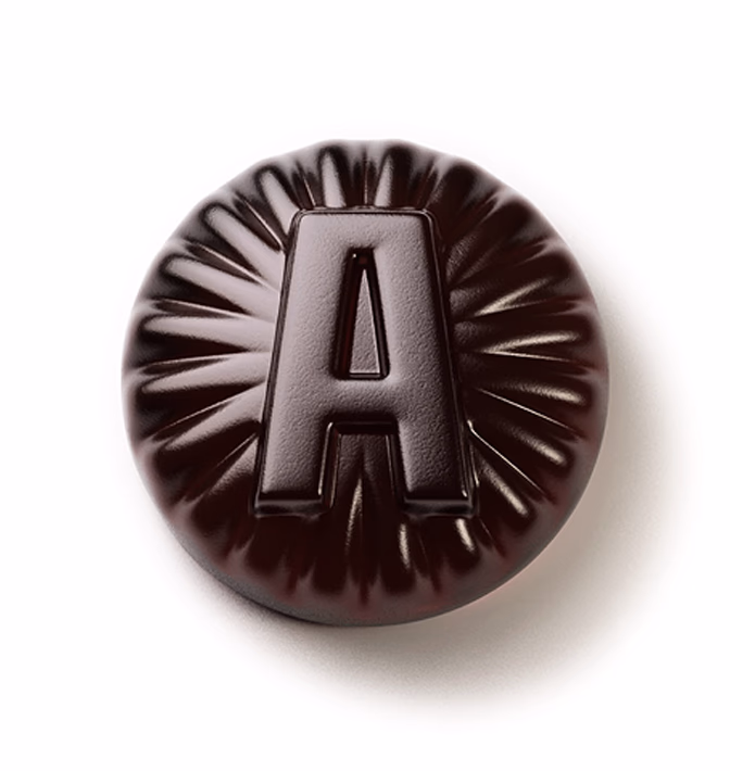
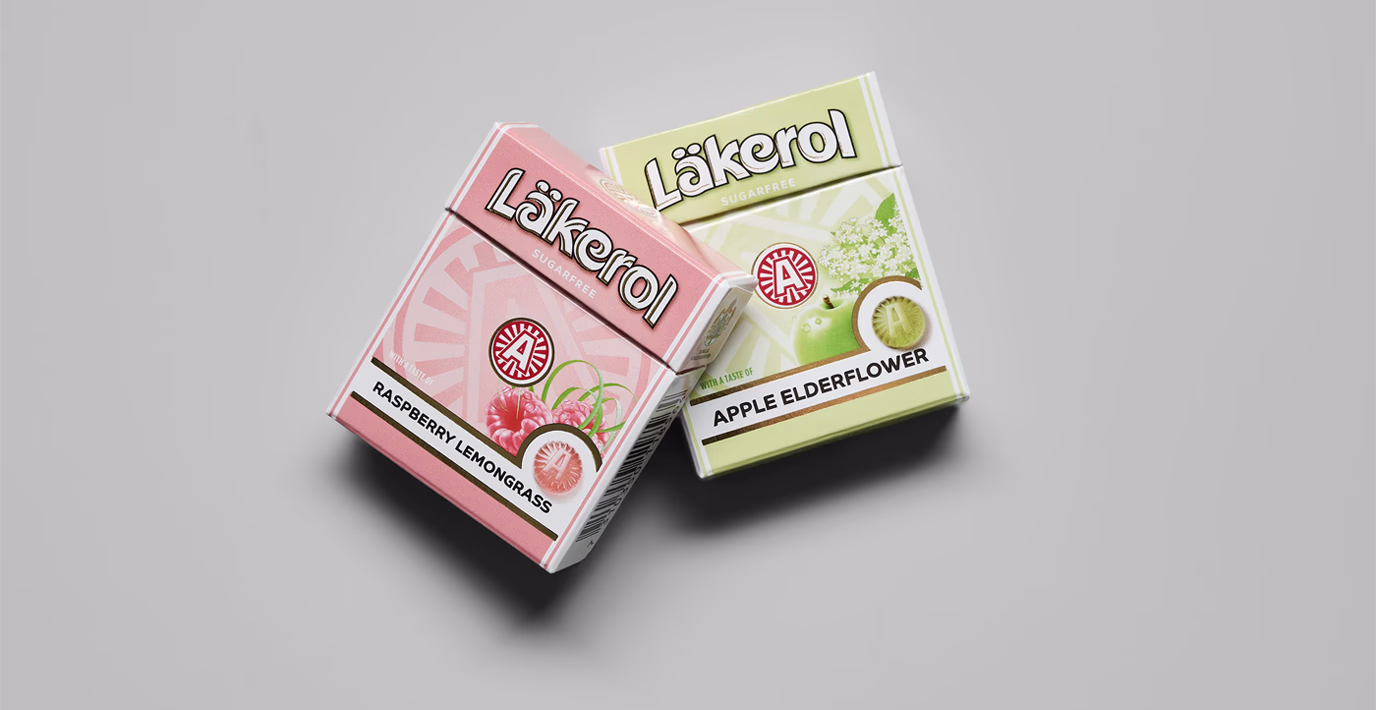
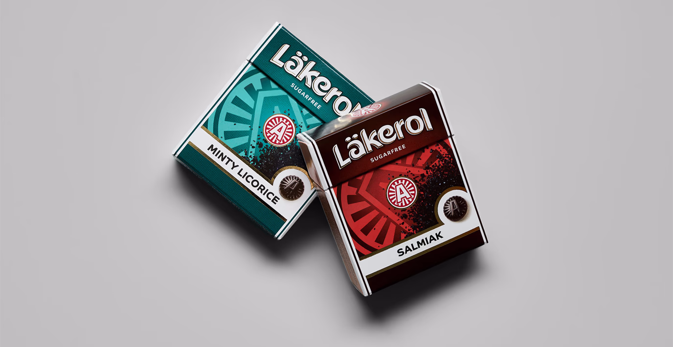
The power of A
Most consumers probably don’t know what the ‘A’ on the Läkerol packaging stands for. Yet, over time, it has become a strong symbol for the brand. With a subtle tweak and some gold foil, we made the letter pop just a little more. (Oh, and the ‘A’ stands for Ahlgrens, as in Adolf Ahlgren – the founder of Läkerol.)
Maximum impact, minimal space
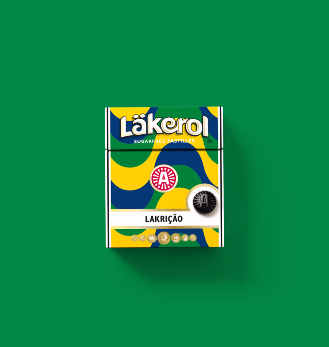
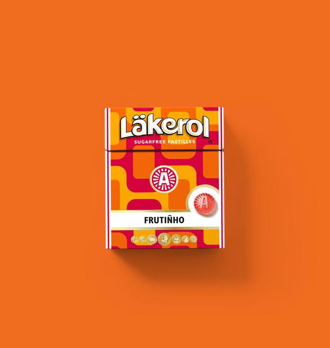
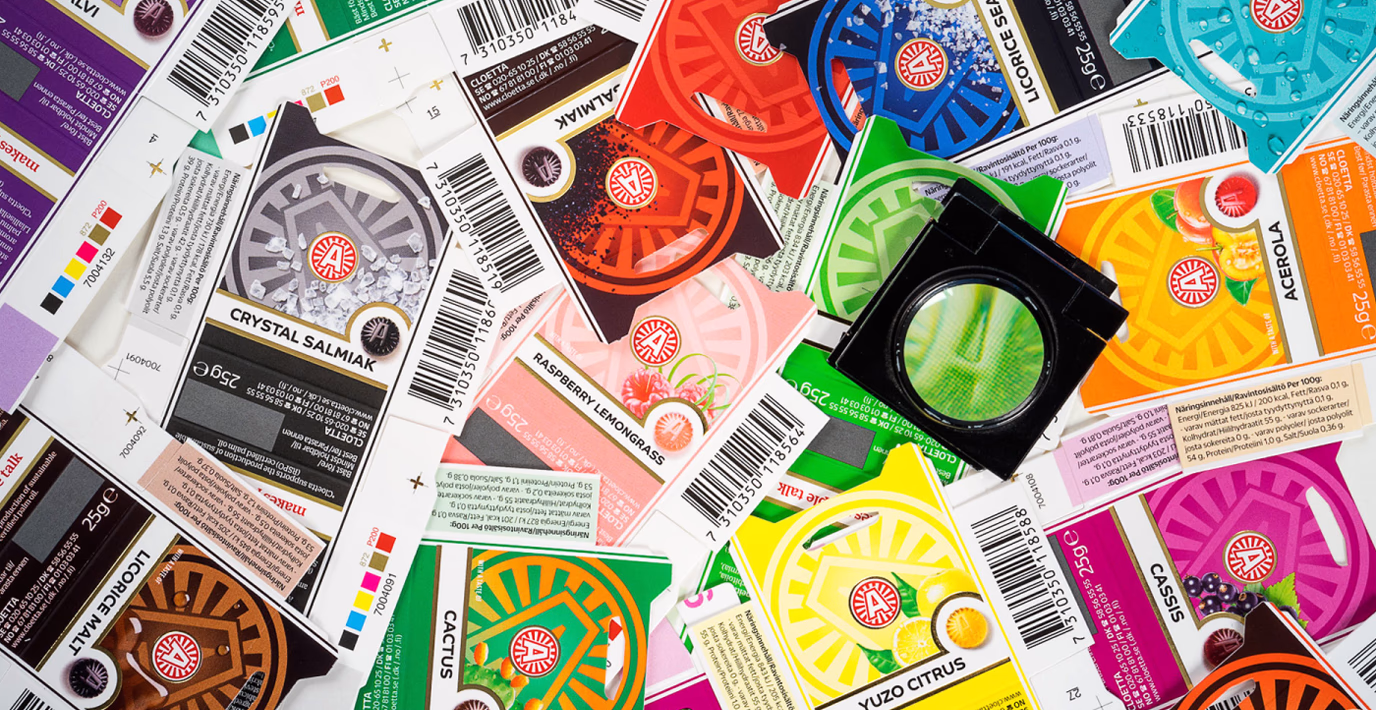
5 x 6 cm isn’t much to work with. But with tempting flavor visuals, clear color cues, beautifully rendered pastilles, and a more balanced background, we boosted the packaging’s stopping power.
Unmistakably familiar, yet refreshingly modern. With soft shadows, gold foil, and an updated wordmark, we gave the logo a contemporary twist – a design ready to shine for years to come.
Fruity, salty, spicy, exotic, vibrant and bold. Take your taste buds on a journey around the globe with Läkerol's limited edition series, inspired by the tropical beaches of Brazil and the bustling markets of Thailand. A true celebration of international flavours and design, this global series brings the taste of adventure to every pastille.