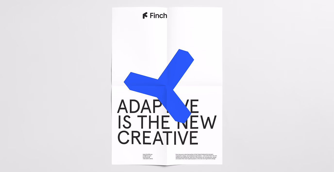
Adaptive is the new creative
Finch combines artificial intelligence, graph technology and advanced algorithms to optimise and streamline the design process for architects. The goal? Smarter decisions, made faster. Neumeister’s task was to build the brand from the ground up – creating a visual identity as dynamic, forward-thinking and precise as the software itself.
Project
Finch Visual Identity
Client
Finch
Assignment
Brand Strategy
Visual Identity
Packaging Design
Packaging Implementation
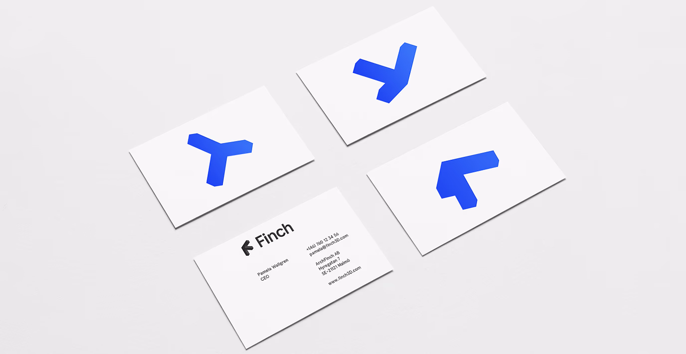
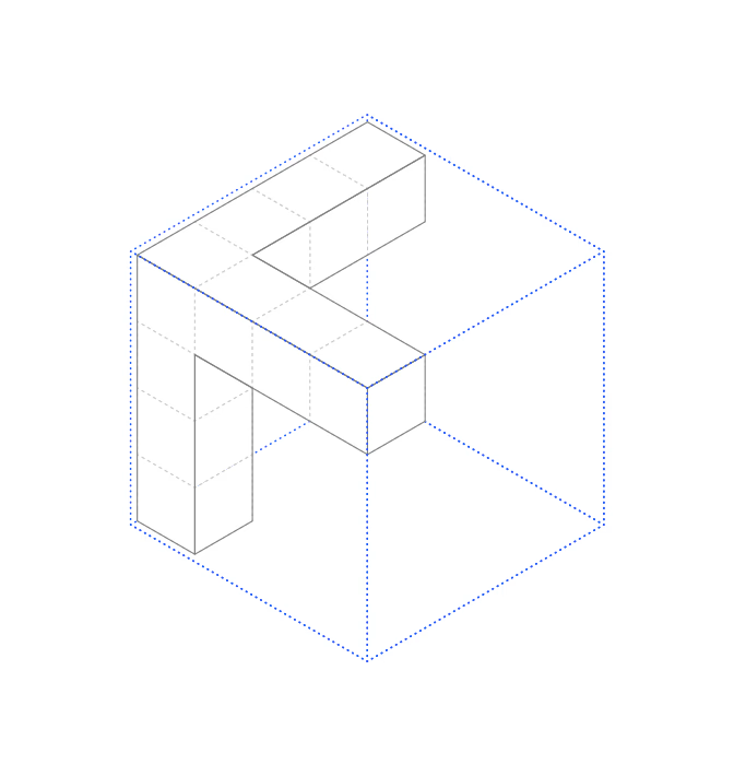
The shape of Finch
The Finch logo captures the intersection where imagination meets design and adaptability – the three axis that define the brand. A smart, geometric form that subtly hints at the letter F. Look closely, and the form also suggests the claw of a finch – a small detail that ties it all back to the name.
The Finch colour palette is built around a single standout shade: pure Klein Blue. Striking, bold and unmistakable, it adds intensity, clarity and a distinct sense of the modern. Used sparingly, it gives every piece of communication a sharp, digital edge.
In constant motion
The icon is rooted in the idea of movement – and it moves. Rotated into different positions, the three axis become one flexible graphic element across print and digital. In motion, it reflects the adaptive nature of the software. In print, it works as a framing device or a structural accent. Always in motion, even when still.
In addition to brand and functional colours, the identity also includes a dedicated set of editor colours – developed specifically for use within the Finch platform. These are used to guide, separate and highlight information, ensuring clarity.