meister

What’s cooking?

Townhouse Nosh and Chow offer a variety of gastronomic experiences under one roof. For their graphic identity we use contrast were the old and rustic meet a highly modern expression. Their logotype is therefore based on nautical typography, along with graphic elements connected to the characteristics of Stockholm as a city surrounded by water.

Minting a fresh design for Läkerol

Läkerol’s classic range of pastilles have been satisfying Scandinavian sweet tooth’s for generations. But to keep up with changing tastes, introducing new flavors is a must. For Licorice Mint Neumeister added a fresh light blue to the palette of familiar, pocket-sized Läkerol boxes.

An A+ presentation

With a presentation on packaging design at Berghs entitled “How to make the innovation process for a brand”, Peter Neumeister appeared as a guest lecturer before marketing managers, product managers and other business professionals. According to those in attendance, Peter graded out very well.

Flavor of the sea

Licorice seasalt is a clear favorite among licorice lovers. In this modern classic two great flavors come together to create a combination as elegant as their new design.

Mariestads

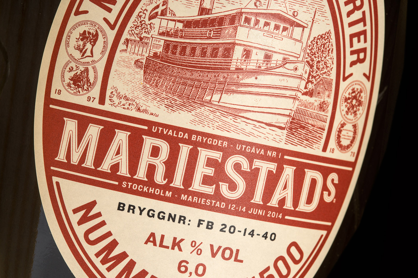
Some traditions change with the times. But since 1848, Mariestads has kept its heritage intact as one of Sweden’s oldest breweries. To honor its iconic market position, Neumeister has designed a new outlook for the brand that pays tribute to the brand’s beginning and celebrates the people of who have loved and brewed Mariestads from the beginning.

Fix it, don’t nix it!

No more dirt, grime or stains, Fixa is taking over. With large, simple graphics and vivid colors it packs a visual punch on the store shelves.

Kustom kulture 2.0

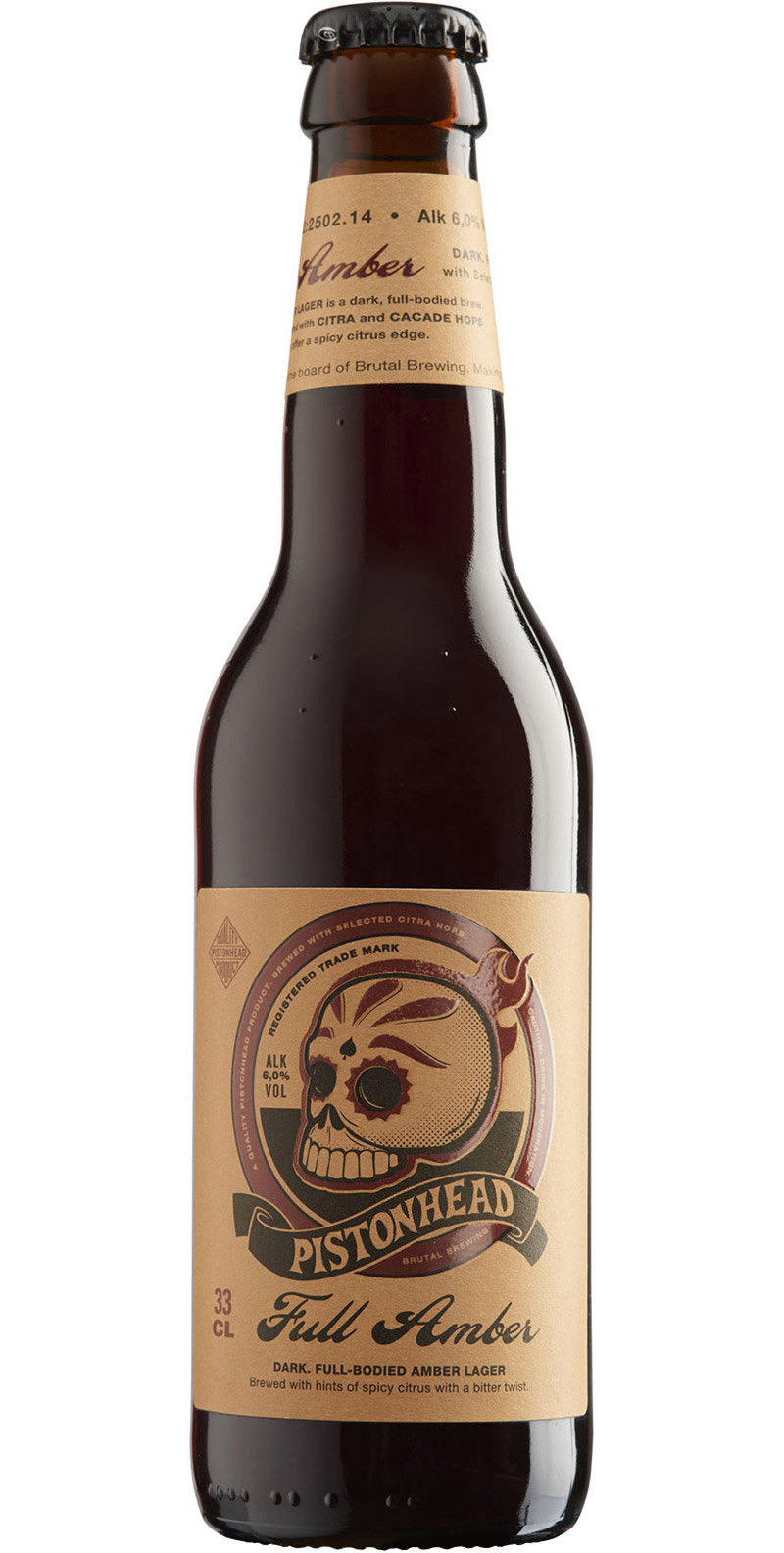
The design of Pistonhead Kustom Lager is moving forward. But no worries, it’s still that smooth and light brew with a spicy citrus edge. Organic and no nonsense in every possible way.

A as in Advertise

The Swedish Advertisers Association was formed 90 years ago. Owned by more than 500 member companies, it’s the world’s largest organization of its kind. Their desire to update the association’s graphic identity led to a new logo, pattern, color and font selection.